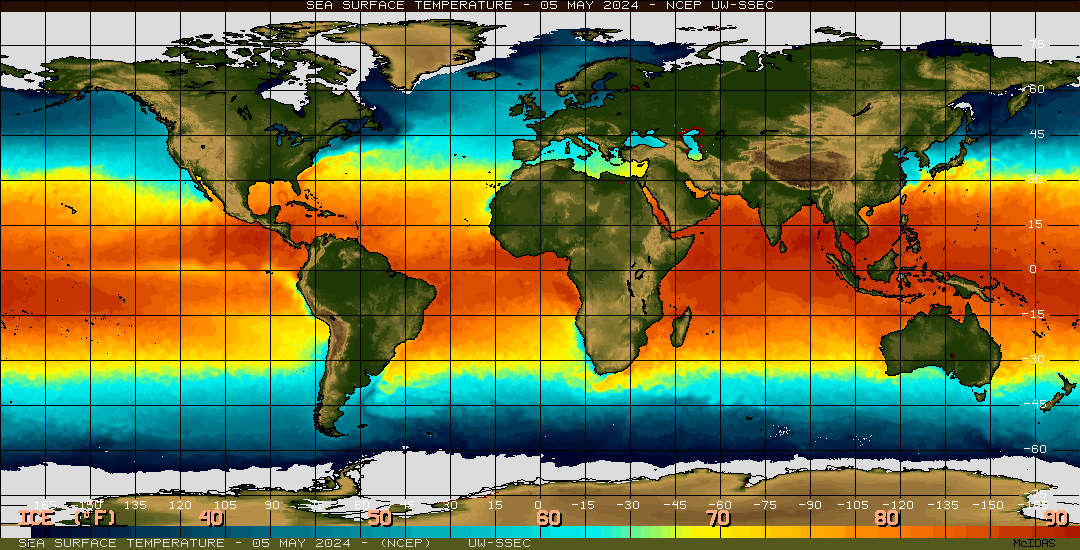
This is a thermal map, using color variation to show surface temperatures across the globe. Warmer waters, found around the tropics are indicated with shades of yellow and orange, whereas colder waters, found around the poles, are shown in shades of blue.
Friday, April 23, 2010
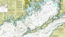
Nautical Map

Nautical Maps are used to navigate the waters. They typically show major land formations, and have numbers throughout the waters to show depths. Modern ones often show markers, buoies, good spots for anchoring, and other such maritime information. This chart also has isolines to show similarities in depths.
Handgun Shooting Symptom Chart
The maps above are shooting charts, used to show a shooter what they may be doing wrong when shooting. It takes the standard bullseye, but breaks down the areas around the bullseye to show what would cause the shooter to hit there, rather than the bullseye.
For example, according to the map on the right, if a left handed shooter is shooting way above the center of the target, they are "breaking too soon".
Mind Map
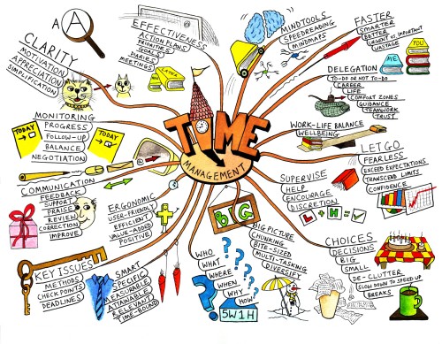
http://techknowtools.files.wordpress.com/2009/04/mindmap_2.jpg?w=500&h=389
Mind Maps are diagrams that convey ideas, tasks, goals, or other such concepts that all pertain to a central idea. They are much like circle maps, however, they are typically more graphical, and use a branching technique to emphasize importance. Larger branches are more important, small branches being less important.
This map focuses on "time management", branching it off into various categories, with subdivisions under each.
Mental Map
 http://www.uneetee.com/category/image/detcol_Cat_HumanMap1.jpg
This Map is supposed to be on the front of a t-shirt. It takes what looks like a typical subway map, but uses it to map the human body. The pink line shows the heart, the green line shows the lungs, the yellow line the stomach, and the blue line the intestines. Its a unique spin on diagraming the human body.
Star Plot

Star plots map multiple varibles, for multiple data sets. This star map plots the Mass, Acutator Saturation, Deflection, Acuracy, Collision, Trajectory Completion, time, and mass, each one indicated by a different spoke, for 5 different designs, each indicated by a different color lined. It is a way of mapping more than just one variable (like your standard XYGraph).
Isoline Map
 http://www.lib.utexas.edu/maps/atlas_mexico/mean_annual_precipitaion.jpg
Isoline Maps use contour lines to join points of the same value. This map shows the precipitation rates of Mexico. This map is also a topographic map, showing the 3D relief of the land, as well as an isohyet map, because it specifically has lines of common precipitation.
Football Play Diagrams
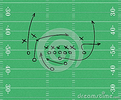
Sport Play Diagrams are examples of maps, showing the starting positions of players on the field, and their intended paths. In this football play diagram, circles reprents plays on the offense, x's represent players on the defense, and arrows show the paths the offensive players should run once the play starts.
Family Pedigree
 http://media-2.web.britannica.com/eb-media/84/784-004-C9BAE345.gif
Family pedigrees are used to track a genetric trait throughout a family. This pedigree tracks the presence of Hemophilia A throughout a family. Circles represent famales, squares represent males. Light blue represents individuals who do NOT have hemophilia A, dark blue represents individuals who do have hemophilia A. The Shapes that are half light blue, half dark blue indicate individuals who carry the gene for hemophilia, but do not actualy express it.
Geneticists use these charts to try and identify instances, and predict the likelithood of an offspring having that trait.
Family Tree

Family trees are examples of maps, showing marriages, offspring, and various relations, over the course of several generations. Often times, horizontal lines connecting two dots show marriage, where vertical lines show relationships between parent and offspring.
Gel Electrophoresis Diagram

Gel electrophoresis diagrams show seperated DNA proteins, and are used in forensics, genetics, microbiology, etc. They are made by inserting DNA into a gel matrix, and running an electric current through. The proteins seperate based on density and weight, and shown under a UV light, to create the diagram above, which can be read by scientists to determine information about DNA. The shade of the lines (reprenting proteins), their proximity to one another, and their overall location all reveal information regarding the proteins.
Star Maps

Star Maps are used to show stars, obviously, often times superimposing constellations over top. This map is an example of a star map, for a the Northern Hemisphere, on a winter night.
Pictograms

http://www.tiresias.org/research/guidelines/images/iso_pictograms2.jpg
Pictograms, are ideograms that show a series of symbols. This one displays various public information symbols
Pie Graph

Pie Graphs take a circle, and divide it into slices, which are proportional to some variable. This pie graph shows the major causes of deforestation in the Amazon. For example, cattle ranches account for 60% of the deforestation in the Amazon, therefore they take up 60% of the circle. Large scale commercial agriculture only causes 1% of the deforestation, therefore it only takes up 1% of the circle.
Scatterplot

Scatterplots use single dots to plot data points on an XY axis. This plot shows the correlation between years of experience in a career and income, with a trend line showing the best fit line to represent this data.
Venn Diagrams
Venn Diagrams use circles to list information, and their overlapment indicates common charateristics. Information in the part of the circle that is not shared with any other circle applies soley to that circle. For example, in this one, only lizards have scales ane are reptiles. Infomation that is listed in overlapping parts of circles applies to both. For exaple, both Lizards and dogs have 4 legs.
Bubble Maps

This is an example of a bubble map, which use circles, centered around a central idea, to show information related to that central idea. For example, this bubble map describes rain (in the central circle), using adjectives (in the surrounding circles).
Windrose

Windroses are graphs used by meteorolgists to convey wind speed and direction around a particular location. The colors are representative of the speeds, where as the length the spokes extend correspond to the frequency of the wind in that particular direction. This windrose shows information about Seattle, WA.
Population Profiles
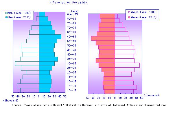 http://www.i-pal.or.jp/profile/Population_Pyramid.jpg
Population Profiles display information about a surveyed population, in this case, the various ages within the population. The one on the left represents the ages of men, the one on the right represents the ages of females. They have a central point, with two seperate axes extending to the left and the right. On both of these profiles, the green bars to the left show the data for 1975, and the orange bars to the right show data for 2005. These profiles are very useful when comparing sets of data.
Box Plot
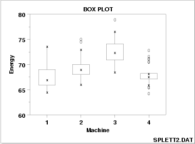 http://www.itl.nist.gov/div898/handbook/eda/gif/boxplot0.gif
Box Plots display the "five number summaries" of specific data sets. These plots show the minimum, lower quartile, median, upper quartile, and maximum for a specific variable. This plot shows the five number summaries for the energy outputs of Machines 1, 2, 3, & 4.
Resource Maps

http://www.lib.utexas.edu/geo/pics/landresj3.jpg
The Above is an example of a Land Resource Map, showing the various natural resources throughout the state of Texas. The key at the bottom explains what color represents which resource, such as sand, clay, chalk etc.
Cartographic Animations

Cartographic Animations are used to show a combination of true, and not necessarily true data. In this map, we see a topographic map, showing the relief and elevation of a mountain, with colored lines used to superimpose hypothetical trails around the mountain.
Parellel Coordinate Graph

http://www.evl.uic.edu/cavern/multiperspective/Continuum/Training/parallel5.jpg
Parallel coordinate graphs are used to show multiple data sets on a single graph. Different variables are plotted along the y-axis, to show how they are related to variables along the x-axis. This particular graph shows the relationship between weight, L1, L2, L3, Height, Width, L21, L32, and L31.
Planimetric Map

Planimetric maps, used to show 2 deminsional or horizontal layouts, are very common when used for city maps. This map shows the city of Vancouver, pointing out street layout, rivers, buildings, etc.
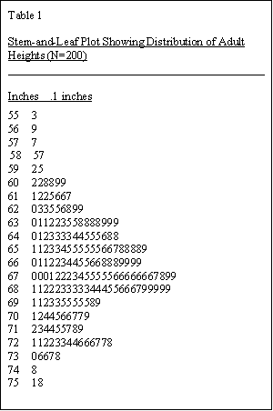
Stem & Leaf Plot
 http://www.eduplace.com/math/mhm/5/06a/ts_5_6a_wi-1.gif
Stem & leaf plots use a stem, typically the digit in the ten's place, and a leaf, the digit in the ones place. This particular plot is showing the age of people present at a family reunion. Forexample, the second row shows that there was a 32, 34, and 37 year old present.
Doppler Radar

Doppler Radar uses the doppler effect to form arial images showing objects at a distance. It is most often used in weather forcasting, and aviation, this one used to show moving air currents and their velocity.
Hypsometric Maps

http://www.earthexplorer.com/2009-03/images/Figure-3---Topographic-hypsometric-map-of-Goiania-Metropolitan-Region_big..jpg
Hypsometric maps are topographic maps that show relieft of the terrain, by using variations in colors. This map shows the terrain of the Goiania Metropolitan Region, with a key on the right side used to exlain the relation between color and elevation.
Classed Choropleth Map

Classed Choropleth Maps use variations in color to display statistical information. This map uses five variations of blue to represent the educational expenditures of each state. Darker blues represent more money spent, whereas lighter shades indicate less money spent.
Range Graded Proportional Circle Map

Range Graded Proportional Circle Maps use circles, or in this case spheres, of various size to to indicate variations of data. This map uses spheres to show the number or Mexicans throughout the western United States. The largest spheres (ie: Texas and California) indicate 6 million, the smallest spheres (ie: North Dakota) indicating roughly 3000 Mexicans. (This map happens to display the actual number of Mexicans next to the dot)

Dot Distribution Map
 Each dot indicates an area of duckweed occurrence.
Legend for numbers: The occurrence of Lemnaceae lacking due to: 1 = too dry, 2 = too wet, 3 = too cold, 5 = not sufficiently explored
http://www.mobot.org/jwcross/duckweed/Lemna_graphics/Map2.gif
Dot distribution maps use dots top show incidents. This particular map is used to show the presence of Duckweed across the world. This number also cooresponds to a legend displayed at the bottom, indicating the type of environment.
Prism Maps

http://www.mpassociates.gr/software/distrib/science/golden/PrismMap.gif
Prism Maps use variations in 3-D height to express a difference in variable. This prism map shows the number of confirmed West Nile viruses in the United states, with the shortest states having no cases, and the tallest state (Minnesota) having 661 cases. This map also uses a color code and a cooresponding key to display distances from the Mississippi River, to compare instances of West Nile and proximity to The Mississippi.
Cartogram

Cartograms are thematic maps, used to display some type of variable, in this case the population of Great Britain. The cartogram to the left shows the population in 2001, where the cartogram to the left shows population change since 1991. Variation in color cooresponts to a legend, which conveys that particular area's population or change.
Bilateral Graph

Bilateral graphs are bar graphs, used to display multiple data sets on the same axis. This particular bilateral graph is used to show trade from 2003-2007, breaking this down to show exports, imports, and total trade.
DOQQ

This is a Digital Orthoimagery Quarter Quadrangles (DOQQ) image of Washington D.C. DOQs combine arial photography with computer imaging to remove terrain relief. This particular DOQ uses infarred light, while some use black and white, or natural color.
Thursday, April 22, 2010
Ifrared Arial Photo
 http://midgewater.twdb.state.tx.us/bays_estuaries/graphics/bay.jpg
Infrared Aerial Photo used to show 7 sources of freshwater, flowing into San Antonio Bay and the Guadalupe Estuary, Texas. The variations in color show variations in sediment in the water.
Black and white arial photography

Black and White arial Photography are basically just as they sound. Photographs taken from an arial perspective, and displayed in monocrome spectrum. This particular photo shows downtown Johnstown in the 1980s, giving a clear view of the city's layout, major roads, major bodies of water, etc.
Climograph

Climographs are (typically) bar graphs, used to show the annual precipitation and temperatures for a particular region. They often share a common x-asix, which show the months, and have their own, appropriate y-axises, showing either measure of rain or temperature. This Climograph also included a graph in the middle, which tracks the variations of the sun, from 23.5 degrees south, to 23.5 degrees North, because this climograph is comparing low latitude, tropical areas between the Tropic of Capricorn & Tropic of Cancer.
LADAR
 http://vulcan.wr.usgs.gov/Volcanoes/MSH/Eruption04/Monitoring/ImagesGraphics/LIDAR_crater_dome_sept03_and_nov04_animated_small.gif
LIDAR, or Light Detection And Ranging, is a method, much like radar, that uses pulses of scattered light to form an image. This image shows the topography of Mount St. Helens, and is actual an animation, switching between two LIDAR images, to show the changes occuring in the crater of Mt. St. Helens
Triangular Plot
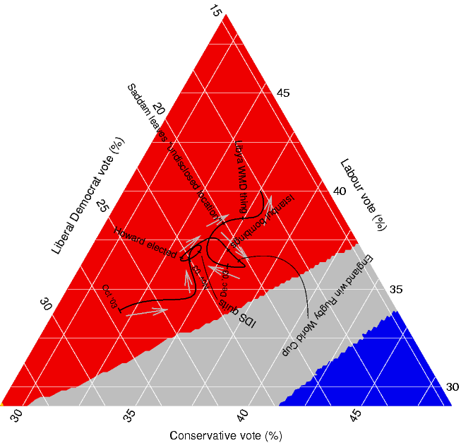
This Triangular Map shows the possible or predicted outcomes for an elections. Triangular maps have three sides, representing three different variables, which are then used to calculate some sum, in this case, total votes from the 3 represented voting classes (liberal, conservatice, labour).
Coorelation Matrix

Correlation Matrices show relations between two variables, one along the x-axis, one along the y-axis, with their shared cell indicating a value, and/or color corresponding to that value. This correlation matrix shows correlation between the cluster moments for electrons and pions.
Similarity Matrix
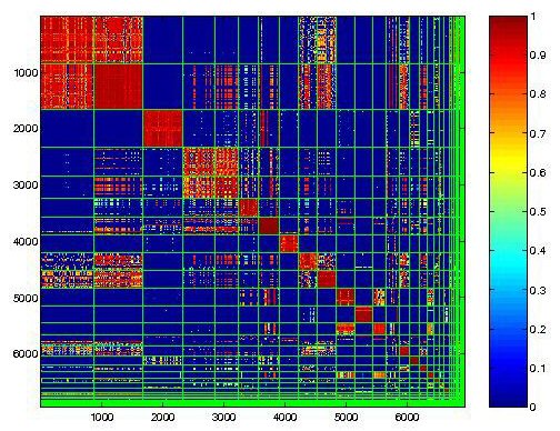
Similarity Matrix express the similarity between two data points. This Matrix shows the similarities in synopsises, with high values, 1 being the highest, and represented by the color red, are assigned to most similar variables.
Flow Charts
 http://pangea.tec.selu.edu/~abolin/etec645/fproduct_1.jpg
Flow Charts use arrows between boxes to show progression of information or events. This one shows events in the life of a girl, Molly, and how one lead to the other.
Histogram

Histograms are bar graphs showing frequency (y-axis) of certain variables, in this case number of weeks (x-axis). This histogram shows the number of weeks spent waiting for a contraceptive order.
Isopachs
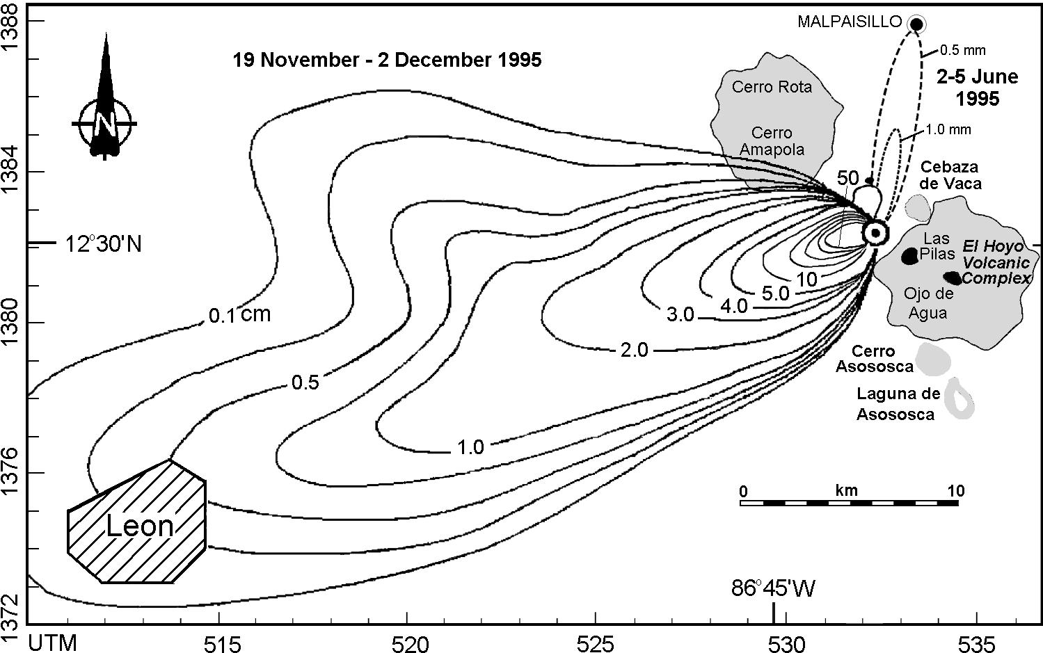
Isopach maps use contour lines to show variations in thickness. This maps shows variations in thickness of ash falling from the volcano Cerro Negro.
Isohyets

This isohyets shows the mean annual rainfall in Tasmania, using different colors to correspont to different precipitation levels, with the key shown to the left.
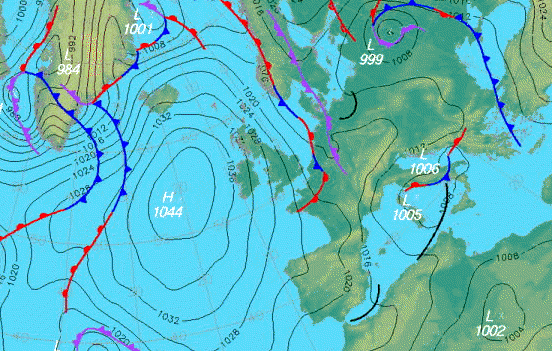
Isobars
 http://www.halesowenweather.co.uk/isobars.gif
Isobars are graphs using lines to connect areas of equal relevance, in this case, connecting equal atmospheric pressures across Europe.
Isotachs
 http://www.erh.noaa.gov/btv/events/28Oct2008/300mb_isotachs_28_18z.gif
Isotachs use contour lines to show wind speeds. This map shows winds, supperimposed over the United States, with various shades of white-blue representing different wind speeds.
Subscribe to:
Posts (Atom)