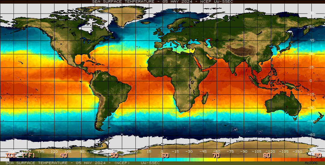
This is a thermal map, using color variation to show surface temperatures across the globe. Warmer waters, found around the tropics are indicated with shades of yellow and orange, whereas colder waters, found around the poles, are shown in shades of blue.
Friday, April 23, 2010
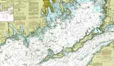
Nautical Map

Nautical Maps are used to navigate the waters. They typically show major land formations, and have numbers throughout the waters to show depths. Modern ones often show markers, buoies, good spots for anchoring, and other such maritime information. This chart also has isolines to show similarities in depths.
Handgun Shooting Symptom Chart
The maps above are shooting charts, used to show a shooter what they may be doing wrong when shooting. It takes the standard bullseye, but breaks down the areas around the bullseye to show what would cause the shooter to hit there, rather than the bullseye.
For example, according to the map on the right, if a left handed shooter is shooting way above the center of the target, they are "breaking too soon".
Mind Map

http://techknowtools.files.wordpress.com/2009/04/mindmap_2.jpg?w=500&h=389
Mind Maps are diagrams that convey ideas, tasks, goals, or other such concepts that all pertain to a central idea. They are much like circle maps, however, they are typically more graphical, and use a branching technique to emphasize importance. Larger branches are more important, small branches being less important.
This map focuses on "time management", branching it off into various categories, with subdivisions under each.
Mental Map
 http://www.uneetee.com/category/image/detcol_Cat_HumanMap1.jpg
This Map is supposed to be on the front of a t-shirt. It takes what looks like a typical subway map, but uses it to map the human body. The pink line shows the heart, the green line shows the lungs, the yellow line the stomach, and the blue line the intestines. Its a unique spin on diagraming the human body.
Star Plot

Star plots map multiple varibles, for multiple data sets. This star map plots the Mass, Acutator Saturation, Deflection, Acuracy, Collision, Trajectory Completion, time, and mass, each one indicated by a different spoke, for 5 different designs, each indicated by a different color lined. It is a way of mapping more than just one variable (like your standard XYGraph).
Isoline Map
 http://www.lib.utexas.edu/maps/atlas_mexico/mean_annual_precipitaion.jpg
Isoline Maps use contour lines to join points of the same value. This map shows the precipitation rates of Mexico. This map is also a topographic map, showing the 3D relief of the land, as well as an isohyet map, because it specifically has lines of common precipitation.
Subscribe to:
Posts (Atom)