http://www.flatrock.org.nz/topics/new_jersey/assets/nj_population_distribution.jpg
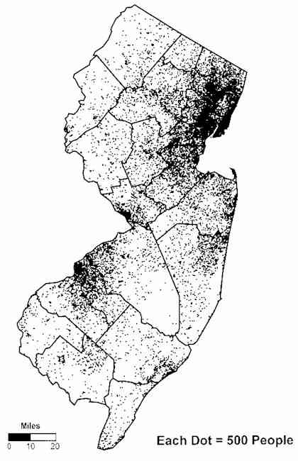
Used to show the population distribution throughout the state of New Jersey. Good way to show where populations are most/least dense. Lower righthand corner indicates that each dot represents 500 people.